Authoring extensions
Introduction
The Theatre.js Studio API enables you to define extensions that extend the Studio's UI and/or extend the functionality of Studio.
- You can extend the UI with your own custom toolbar buttons, toolbar switches, and panes.
- You can extend the behavior of Studio by setting Selections, listening to Selection changes, and creating custom editing tools for Theatre.js Objects.
This extension API is not stable, and it will change in the future, but it is relatively easy to use. To help you learn the API, this article walks through building an example extension that shows off some core features of the API. But, before we start building, let's take a look at the Studio, so we know what and where buttons, switches, and panes are.
Anatomy of the UI
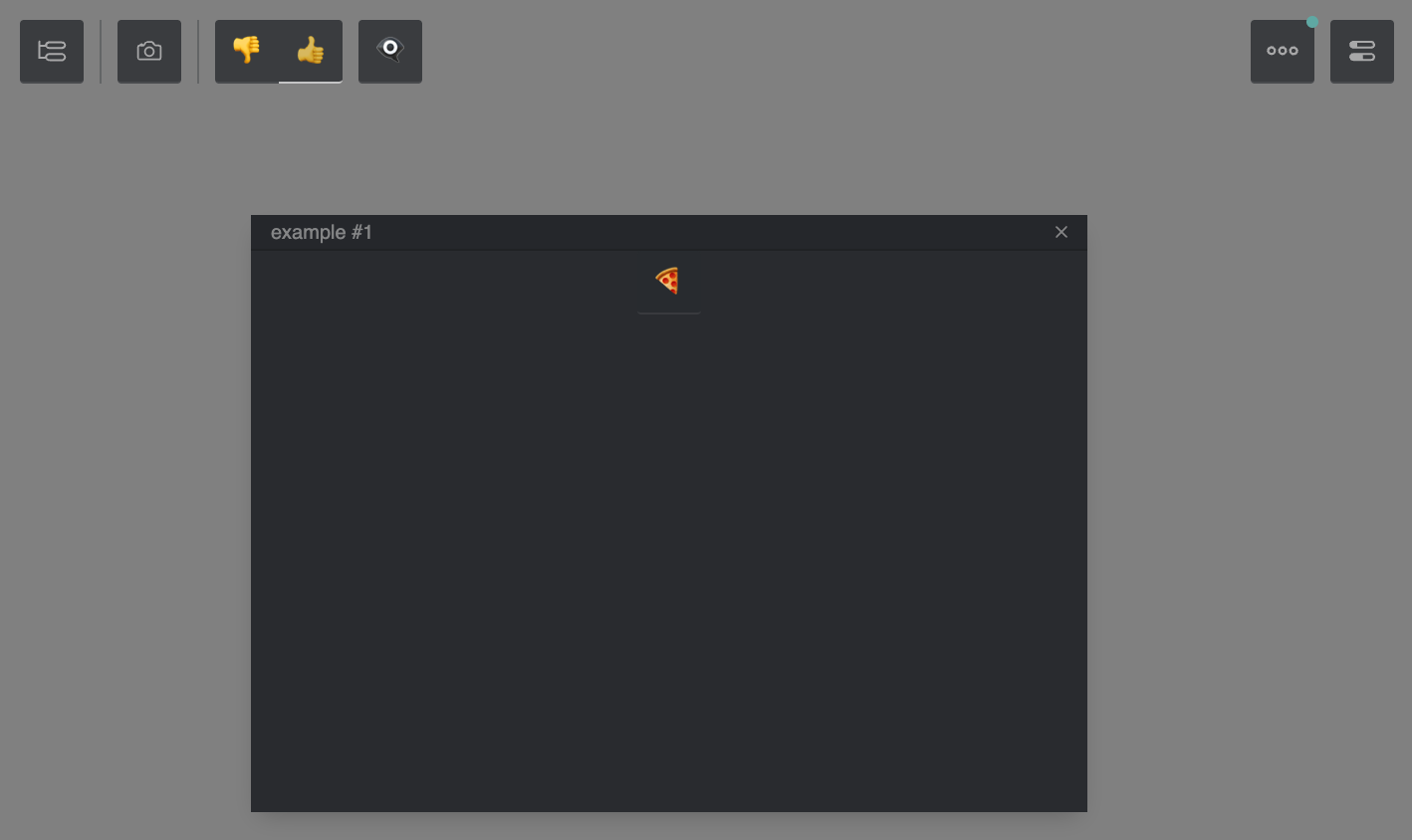
Here's an image of the Studio with two extensions on a webpage with a gray background. Below the image is a table naming and describing the parts of the UI.
| Studio Component Image | Name | Description |
|---|---|---|
 | Global Toolbar | This is the top-left area of the UI containing the Outline button and global buttons and switches added by extensions. |
 | Outline Button | Part of the default UI. Clicking it opens and closes the Outline tree. |
 | R3F Extension "Snapshot" Button | A button added to Studio by the R3F extension. Clicking it opens the extension's snapshot pane. |
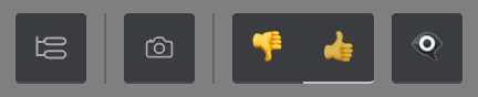
 | Example Extension Switch and Buttons | A switch with two options (👎 and 👍) and a button (👁🗨) added to Studio by an example extension. |
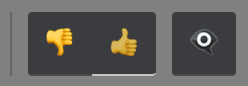
 | Example Extension Pane | A pane added to Studio by an example extension. The pane contains a toolbar with a 🍕 button. Panes can be opened, closed, resized, and dragged around. |
Extending the Studio
Now that we've taken a look at the different parts of the Studio's UI, let's extend it with our own functionality.
Hello World
Below is the starter code for an extension that, so far, just has a single toolbar button. After adding this code to your project, you will see an additional "👁" button appear in the top left of Studio; hovering over the button will display the tooltip "Example Button".
// The code below assumes that your project is set up with TypeScript and a bundler.import studio from '@theatre/studio'const extensionConfig: IExtension = { id: 'hello-world-extension', toolbars: { global(set, studio) { set([ { type: 'Icon', title: 'Example Button', svgSource: '👁', }, ]) }, }, panes: [],}studio.extend(extensionConfig)studio.initialize()
Extensions are defined using a JavaScript object that your code passes as an argument to studio.extend(extensionConfig)
before your code calls studio.initialize().
Your extension object requires a unique id, a toolbars object – an object containing functions that set toolbar data so
that Studio can display your extension toolbar buttons and switches –
and a panes array – a list of objects that define your extension's pane metadata and callbacks. We'll
talk about panes below, but for now, let's take a closer look at creating buttons and switches.
Toolbar buttons and switches
In this section, you'll learn how to add custom buttons and switches to the global toolbar as a part of your extension. Note that it is also possible to define custom buttons and switches in panes.
In order to define global buttons and switches, you must implement a toolbars.global(set, studio) function in your extension config object.
This function is called by Studio upon initialization of your extension, with the arguments set and studio.
set(toolset)– a callback that takes an argument of an array of button and switch metadata objects (this array is aToolsetConfig).studio– the entire studio API.
In order to define buttons and switches, you call the set() callback in your extension's
toolbars.global(set, studio) function with a ToolsetConfig array. Let's take a look at how to do that now.
Buttons
Below is a modified TypeScript snippet from the starter code above that defines a button with an onClick callback that you can customize to do whatever you want.
global(set, studio) { const toolsetConfig: ToolsetConfig = [{ type: 'Icon', title: 'Example Button', svgSource: '👁', onClick: () => console.log('button clicked!') }] set(toolsetConfig)},
Switches
Below is a modified toolbars.global(set, studio) function that defines a switch with two options: 'yes' and 'no'.
A switch can have multiple options, but only one may be selected at a time, as determined by the switch's value.
When defining a switch, note that you have to manage setting and changing the switch's value yourself.
To do this, you define an onChange(value) function which calls toolbars.global's set callback with a brand new ToolsetConfig array containing the switch metadata, but with a new value.
Let's take a look at some code that does just that:
import type {ToolsetConfig} from '@theatre/studio'/* ... */const getToolsetConfig = ( switchValue: string, switchOnChange: (value: string) => void,): ToolsetConfig => [ { type: 'Switch', value: switchValue, onChange: switchOnChange, options: [ { value: 'no', label: 'say no', svgSource: '👎', }, { value: 'yes', label: 'say yes', svgSource: '👍', }, ], },]/* ... */global(set, studio) { const setSwitchConfig = (value: string) => set(getToolsetConfig(value, setSwitchConfig)) setSwitchConfig('no') return () => console.log('toolbar removed!')}
Panes
Defining a pane
Panes are like windows that can be opened, closed, resized, and moved around the screen.
Simply add an object to your extension config's panes: [{ class, mount }] array where:
class: "my-pane-name"is a unique name for your pane, andmount(paneInstance) { ... }is a function that is called when your pane is opened
The mount(paneInstance) { ... } function receives an argument object with two properties, paneInstance.paneId and paneInstance.node.
paneIdis a unique ID string assigned to the pane when it is opened.nodeis an HTML element that you will programmatically put your pane's contents into.
We can return a () => void function from our mount(pane) function to be called when the pane is closed, which you can use for cleanup.
panes: [ { class: 'example', mount({paneId, node}) { node.innerText = 'Hello World' return () => console.log('pane closed!') }, },],
Opening a pane
To open a pane you defined in your extension, simply call studio.createPane(id).
studio.createPane('example')
Buttons and switches in a pane
If you want to define buttons and switches that show up in a pane instead of in the global toolbar,
you can add a function to your extension's toolbars object with a key other than global.
Let's take a look at how you would set up a toolbar named exampleToolbar that shows up in a pane,
but not in the global toolbar:
const extensionConfig: IExtension = { id: 'hello-world-extension', toolbars: { exampleToolbar(set, studio) { const toolsetConfig: ToolsetConfig = [ { type: 'Icon', title: 'Example Button', svgSource: '🍕', onClick: () => {}, }, ] set(toolsetConfig) return () => console.log('toolbar removed!') }, }, panes: [ { class: 'example', mount({ paneId, node }) { studio.ui.renderToolset('exampleToolbar', node) return () => console.log('pane closed!') }, }, ],}
The two key things to note in this example are:
toolbars.exampleToolbaris defined in the same way astoolbars.global, and- we use
studio.ui.renderToolset('exampleToolbar', node)to insert theexampleToolbarinto our pane's HTML when the pane mounts (when it opens).
Extending Studio behavior
So far we took a look at how you can extend the Studio, in this section we'll see how to extend its behavior.
Setting selections and listening to selection changes
Theatre.js allows one or more Sheets or Sheet Objects to be selected. Selections are represented as a list of the selected Sheets and/or Sheet Objects.
We can listen to selection changes with studio.onSelectionChange(callback).
studio.onSelectionChange((newSelecton) => { // do something})
Here, newSelecton is a list of Theatre.js Objects and/or Sheets.
We can then set the selection with studio.setSelection(array), passing in the Sheets/Sheet Objects to be selected.
const obj = sheet.object('Some Object')studio.setSelection([obj])
Modifying Theatre.js objects programmatically
There are two ways to set the values of props using the Studio API: transactions and scrubs.
Both transactions and scrubs create entries in the Studio history stack, so the author can undo and redo them using ctrl+z.
Usingstudio.transaction(fn)
Change prop values within a callback function, fn.
All changes made within the fn are grouped into a single undoable action.
Changes made inside a transaction are either all committed, or all discarded.
// Commit a transaction to the Theatre.js Project statestudio.transaction(({set}) => { set(obj.props, { ...initial, x: x + initial.x, y: y + initial.y, })}))
Usingstudio.scrub()for moving values
While transactions require us to do all our changes at once, scrubs allow us to add changes to a transaction over time, which we can later either commit or discard. Changes are immediately reflected in the state, however an undo-step is only made on commit.
Scrubs are useful for example to implement drags, where we don't want to individually commit every in-between value to the history stack, only the end-state.
const scrub = studio.scrub()scrub.capture(({ set }) => { // no history changes are actually made until scrub.commit() set(obj.props, { ...initial, x: x + initial.x, y: y + initial.y, })})// We can either commit the scrub, creating an undo-step...scrub.commit()// ...or discard the scrub, reverting the changes made withinscrub.discard()
Managing extension state using Theatre.js Objects
Putting all these concepts together, we can create sheet objects via our extension. This has the benefit of persisting our extension's data across reloads and project states.
import {types, val, onChange} from '@theatre/core'import type {ISheetObject} from '@theatre/core'import type {ToolsetConfig} from '@theatre/studio' global(set, studio) { // A sheet object used by this extension const obj = studio .getStudioProject() .sheet('example extension UI') .object('editor', { exampleProp: types.stringLiteral('yes', { no: 'no', yes: 'yes', }), }) const updateToolset = () => set([ { type: 'Switch', value: val(obj.props.exampleProp), onChange: (value) => studio.transaction(({set}) => set(obj.props.exampleProp, value)), options: [ { value: 'no', label: 'say no', svgSource: '👎', }, { value: 'yes', label: 'say yes', svgSource: '👍', }, ], }, ]) const untapFn = onChange(obj.props.exampleProp, () => { updateToolset() }) // initial update updateToolset() return untapFn },
This approach has the added benefit that the state of your extension is managed by the Studio, and can even be modified and animated using the Studio.
Putting it all together: a direct-manipulation extension
Finally, we can take everything we've learned about extending Studio with buttons, switches, panes and custom tools into one extension! Below is a CodeSandbox with running TypeScript code.
Try clicking and dragging the 🥚, 🐣, or 🐥. Once you've finished dragging, try pressing ctrl+z to undo the drag.
Also try using the Studio Outline tree to select objects and notice how it affects the styling of the 🥚, 🐣, and 🐥
and vice versa. You can even drag around the objects while creating keyframes for animations.
Extensions are hot-reloadableSince 0.7.0
Studio extensions are hot-reloadable, meaning that you can make changes to your extension code and see the changes reflected in the Studio without having to reload the page.
Simply run studio.extend(extension, {__experimental_reconfigure: true}) to replace your extension with its new version.
Next steps
Want to learn more? Take a look at some more in-depth topics from our manual:
Projects
This guide covers creating projects, managing their states, saving and loading their states, and more.
Sheets
This guide covers Sheets in Theatre.js
Sheet Objects
This guide covers Sheet Objects in Theatre.js.
Prop types
Learn how to customize the props you want to animate with Theatre.js. When creating a Sheet Object, we define the props that we want to animate on it. Props can have different types which can be imported from "@theatre/core".
Working with Sequences
In this guide, we'll explore the tools that Theatre.js offers for creating animations.
Assets
Learn about assets in Theatre.js
Using Audio
Learn how to load and synchronize music or narration audio to an animation.
Studio
Learn the different parts of the Studio.
Keyboard & Mouse Controls
A catalog of controls in Theatre.js Studio.
Advanced uses
Was this article helpful to you?
Last edited on February 01, 2024.
Edit this page